

Our beer just got a whole new look ... introducing our packaging redesign!
Something old. Something new. Something borrowed. Something brewed.
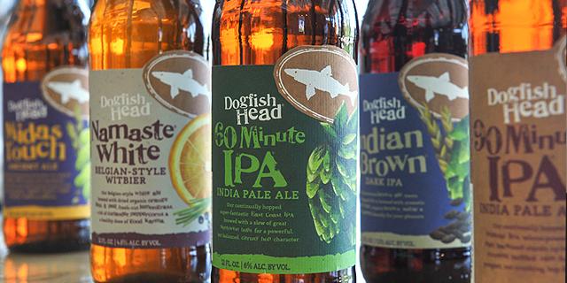
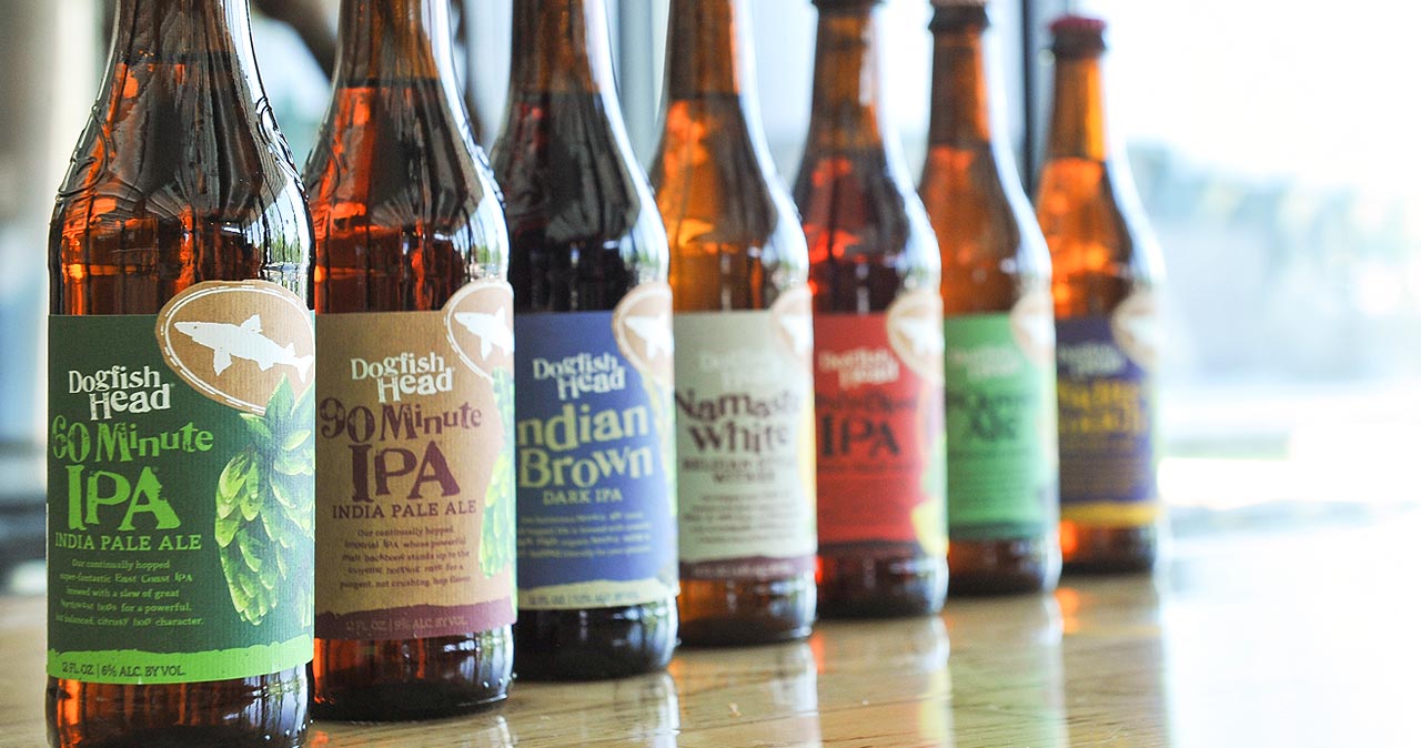
We're beyond excited and proud to introduce our new packaging redesign! Bringing focus to the creativity, high quality and often rare ingredients that go into our eclectic portfolio of beers, this redesign is a welcome addition to our 21-year journey.
A collaboration between our in-house creative team and Interact Boulder - a Colorado-based strategic packaging design firm - seven of our beers will showcase the new design with additional beers to come later in the year.
When Dogfish Head founder and president Sam Calagione opened the Rehoboth brewpub in 1995, innovation wasn’t just an option—it was the foundation for building an off-centered brand. “My goal was to make truly unique beers based on the idea that culinary ingredients from around the world could be as integral for brewing distinct beers as the finest barley and hops,” says Calagione. This new packaging sets out to honor that foundational spirit of off-centered innovation and imagination by highlighting our legacy of exploring goodness through ingredients and process.
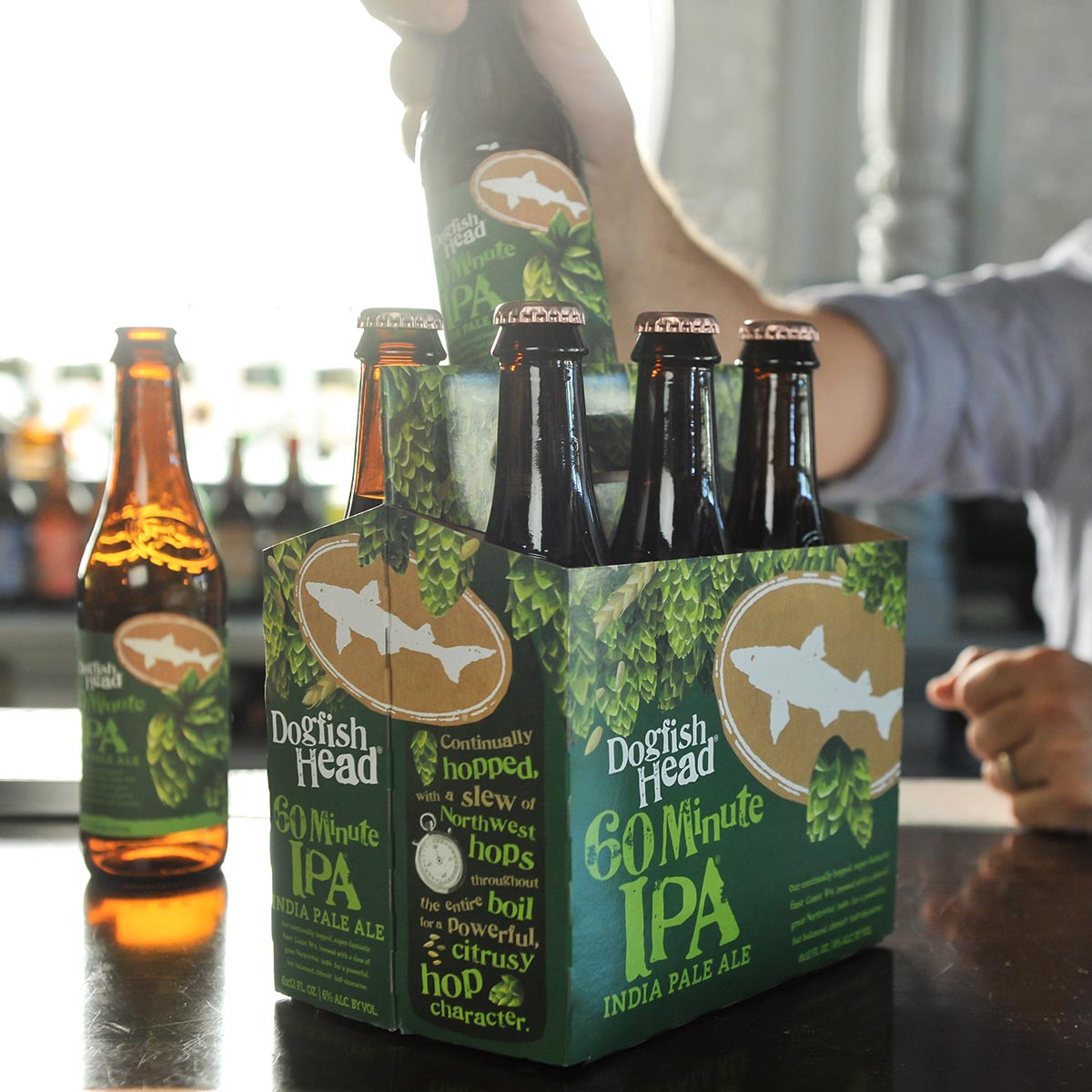
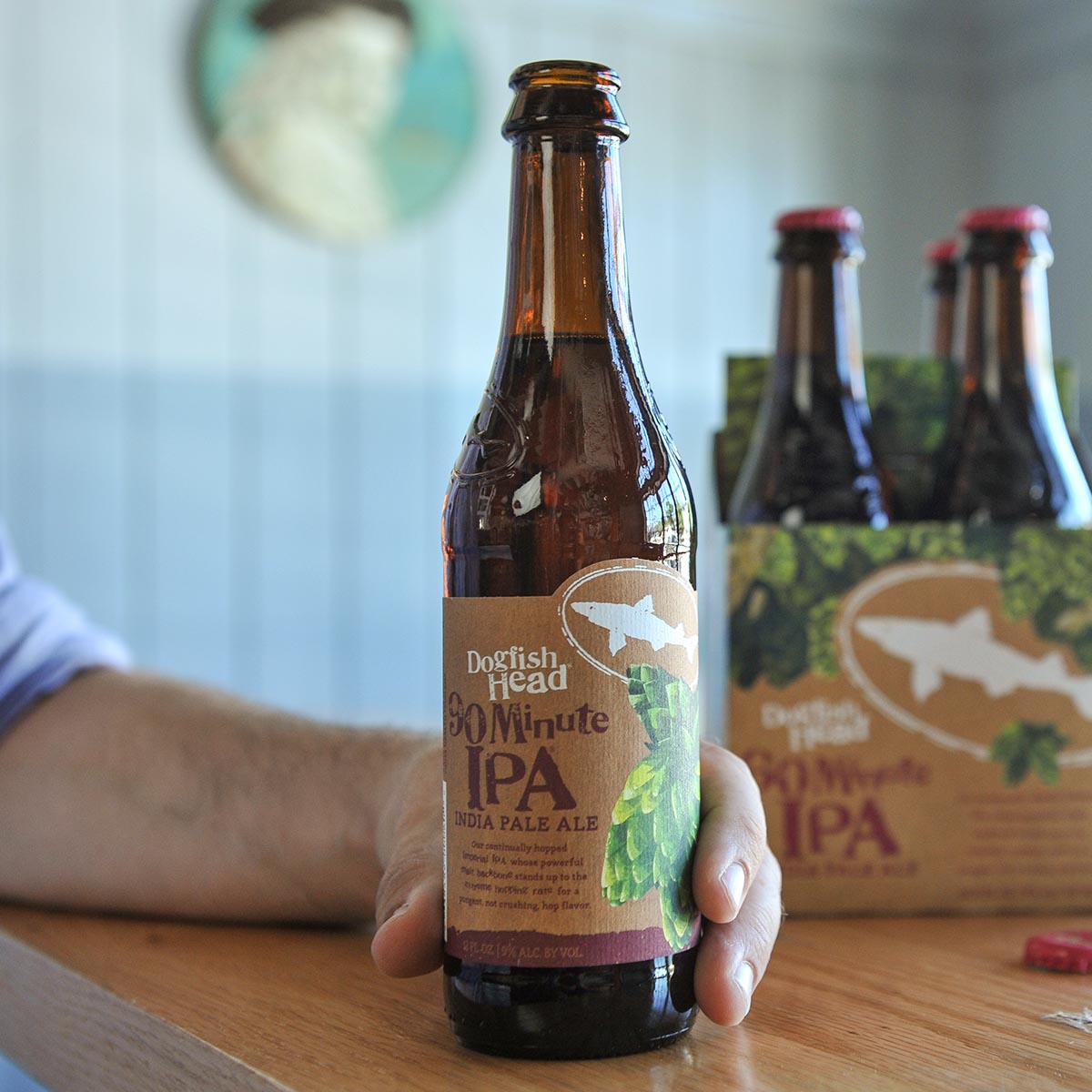
Ingredients are the stars of the design, showcased in playful illustrations that create realistic and authentic flavor expectations in an off-centered manner. You're now able to see what goes into each bottle by viewing the side panel of the carrier, which highlights the specific ingredients and unique brewing processes involved in creating that beer. The handle area is also a unique feature, offering you a literal handful of the ingredients when proudly holding a 4 or 6 pack.
The new design also organizes key information, such as beer style and ABV, in a way that makes it easier for our fans and new fans alike to find exactly what they're looking for. “We wanted to create some uniformity across our portfolio without falling into the trap of being predictable and sterile,” Calagione says. Our iconic Dogfish Head “shark and shield” logo and proprietary “Doggie” font are the two recognizable design elements that will carry through from the old packaging into the new style.
It's been a heck of a ride with that original packaging and we love it just as much as we did in 1995, but we're excited for this next chapter in our off-centered story.
Cheers!